
Project type
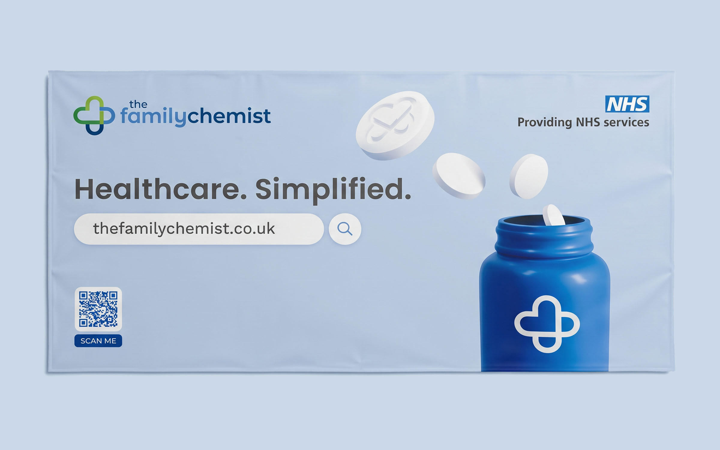
As in-house designer at The Family Chemist, an online pharmacy, I refreshed the identity to bring consistency to a growing brand. A modernised logo and clear guidelines became the foundation for every touchpoint, from the website and Pharmacy Shop to NHS materials and stadium advertising.
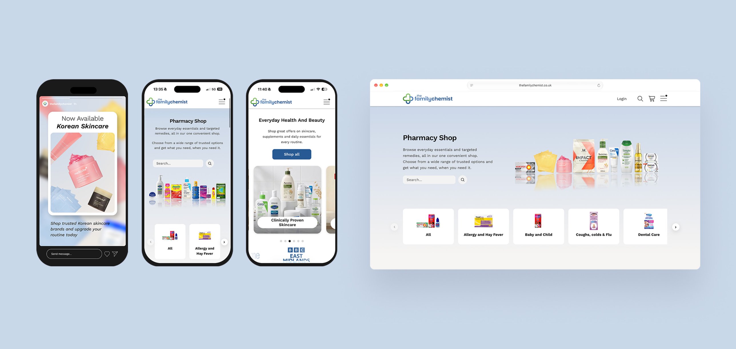
The brand needed a more modern look and a more legible logo, without losing what people already recognised. It also had to work across many touchpoints, including a new Pharmacy Shop that needed its own retail identity, separate from the NHS services and private treatments.
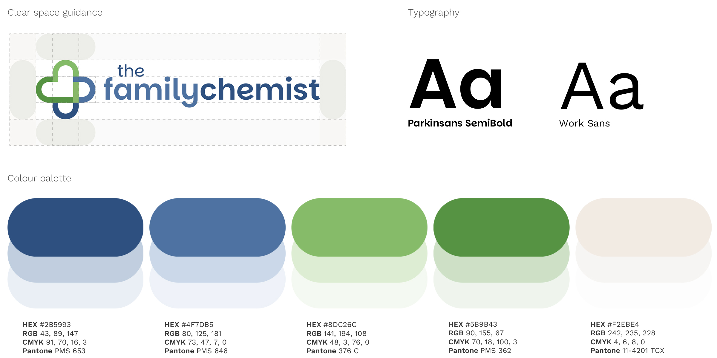
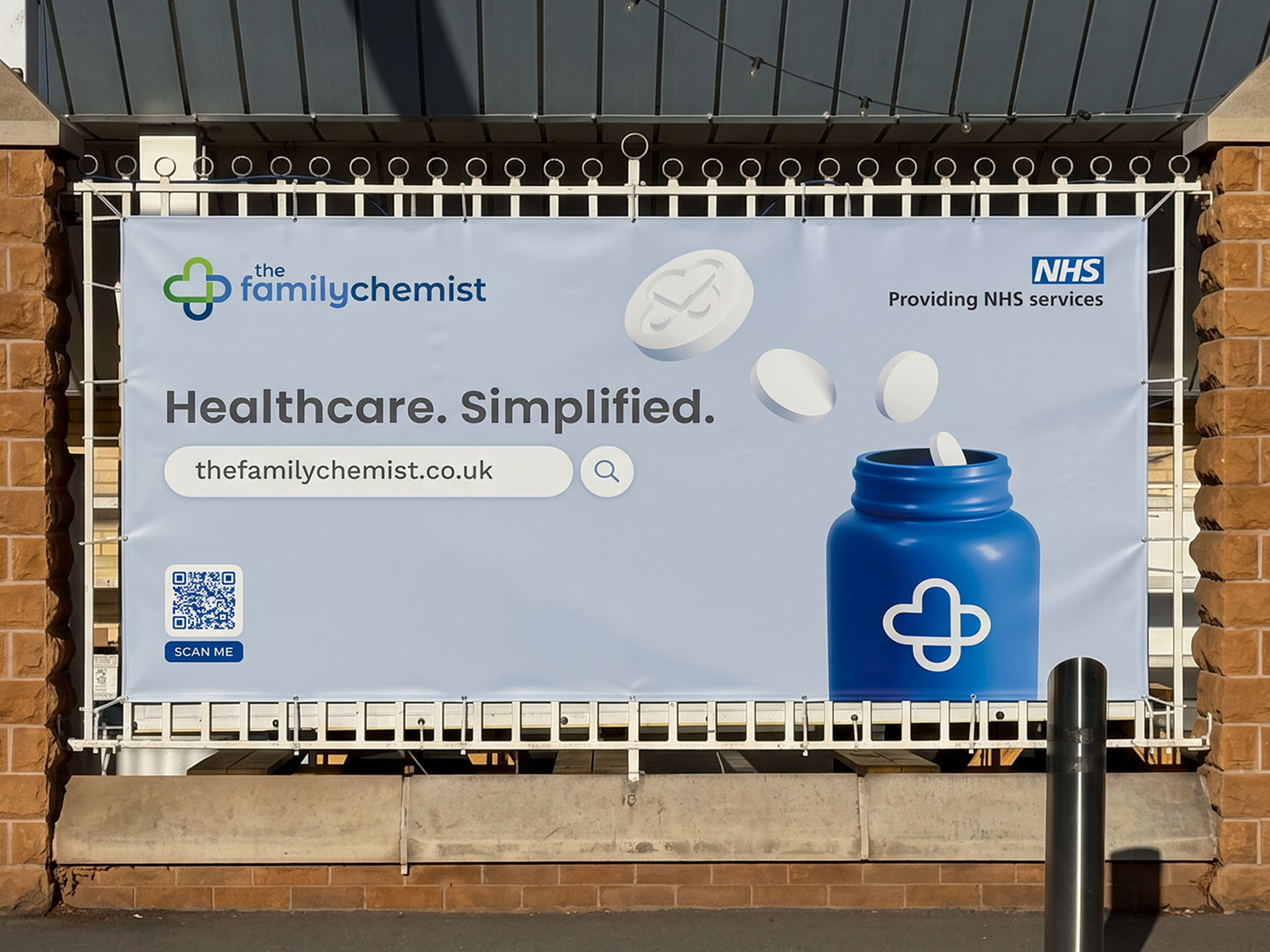
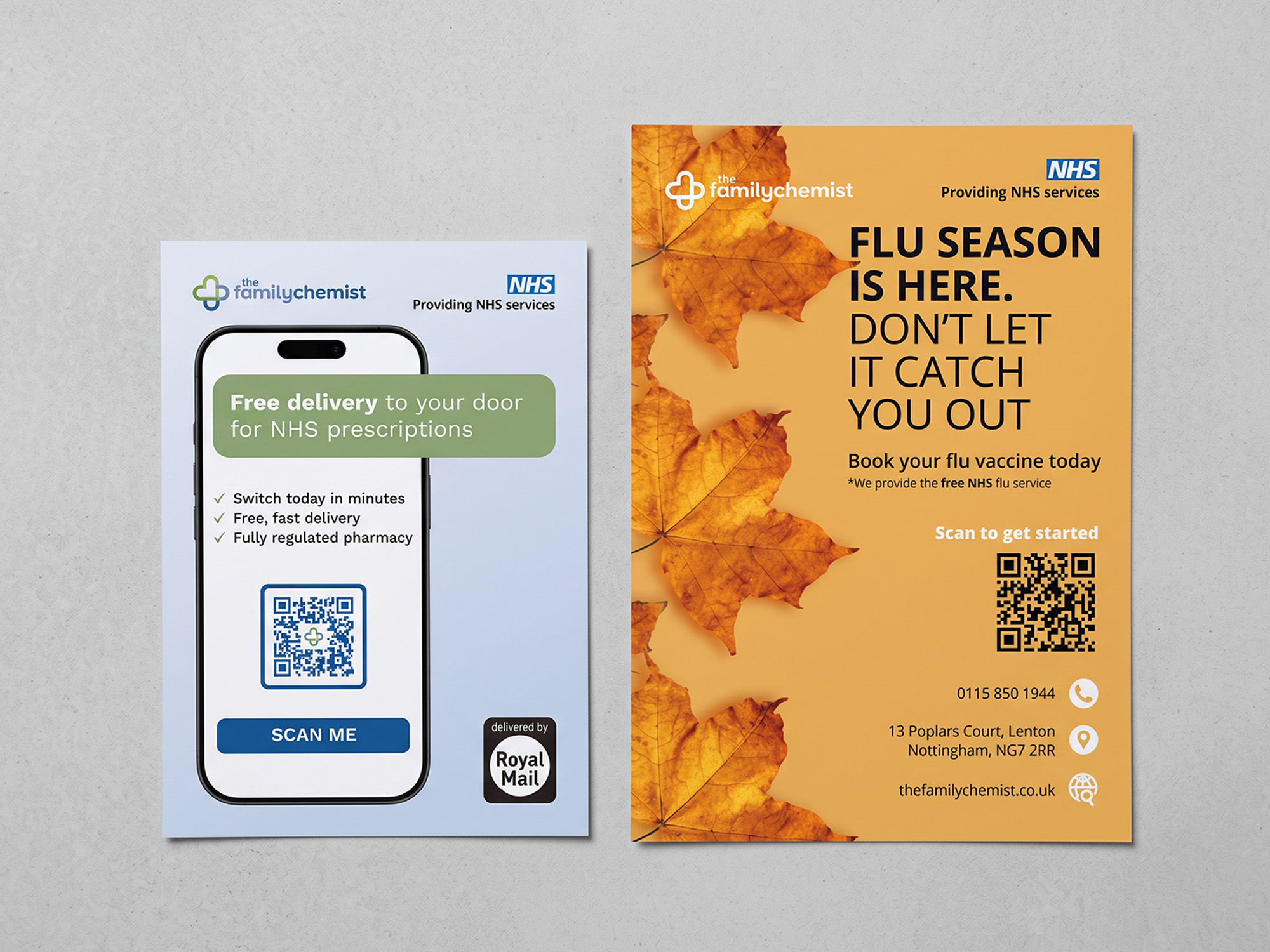
I updated the logo, refined the colour palette and wrote brand guidelines to keep everything cohesive. Then I adapted the design to each format: a shop interface that complements the online pharmacy, clear and accessible NHS leaflets, and a Trent Bridge banner simple enough to read from the roadside.
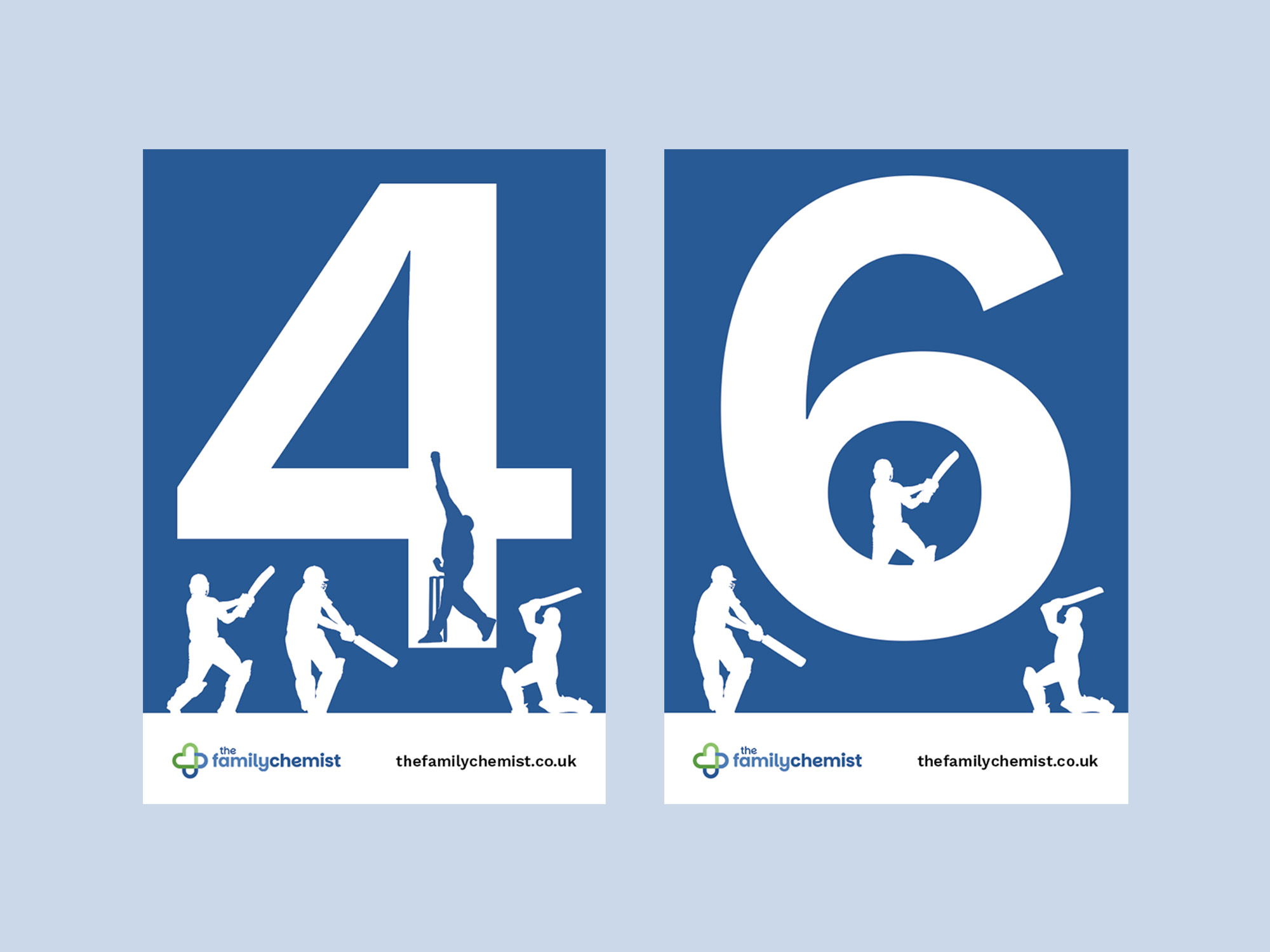
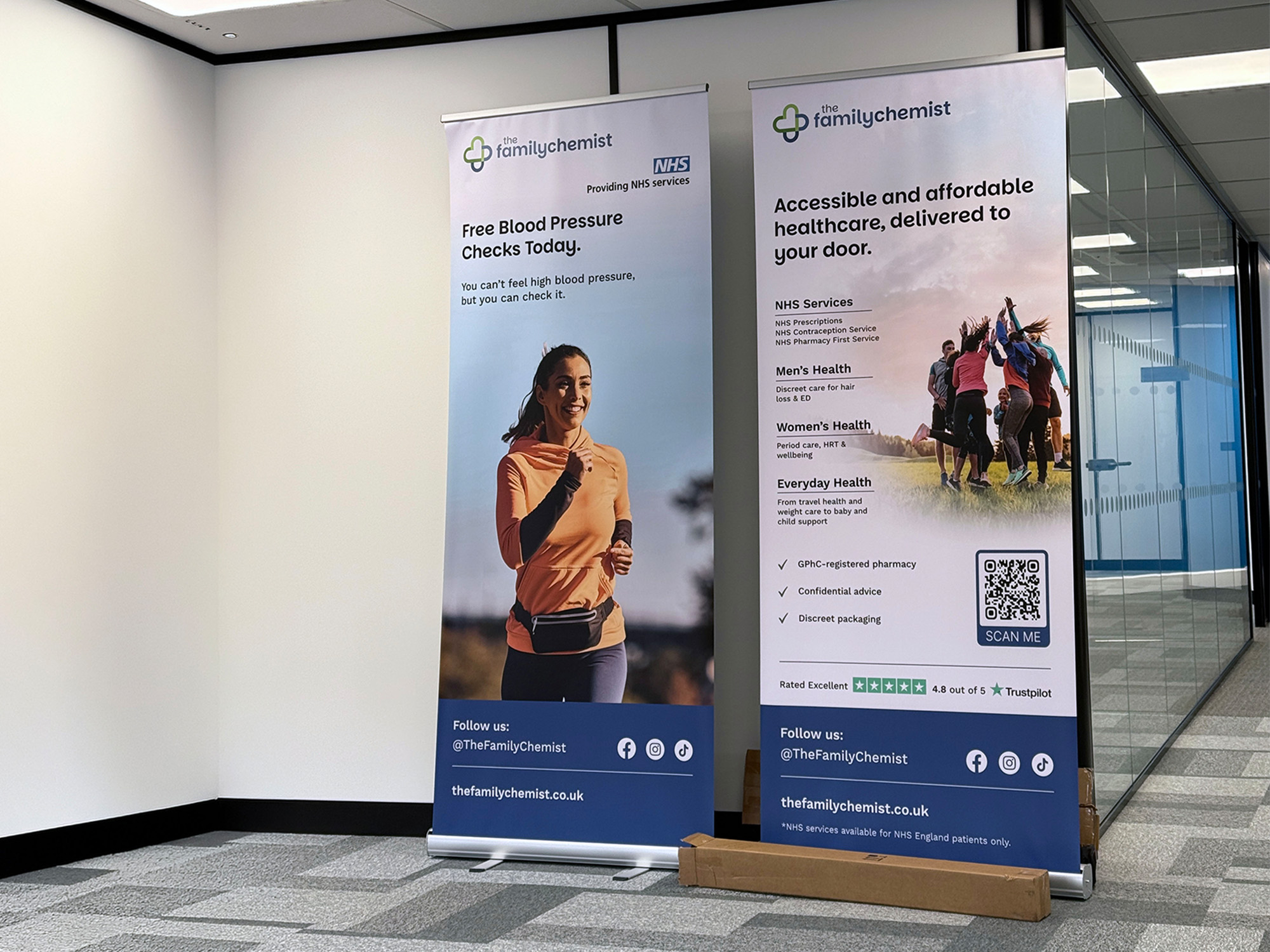
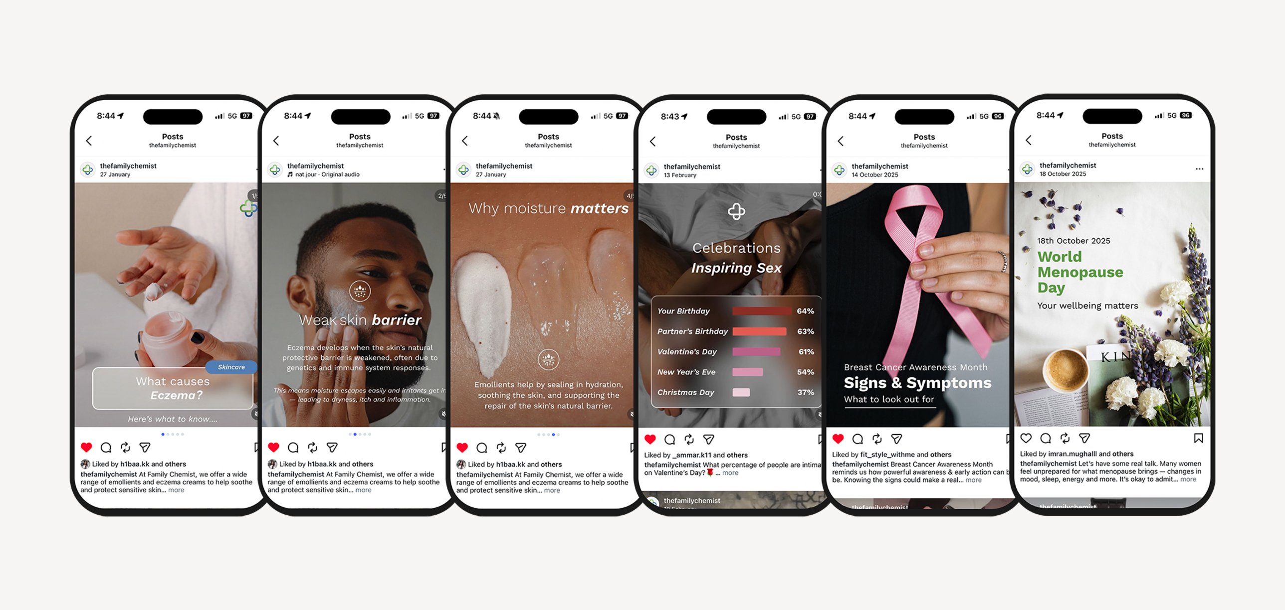
My work covered the logo and guidelines, Pharmacy Shop UI and launch assets, emails, social posts and paid ads, plus NHS leaflets, pull-up banners, a fence banner and cricket scorecards. Preparing print-ready artwork with suppliers taught me about specifications, paper stocks and taking designs through to production.
Next project
UX/UI Design, Branding